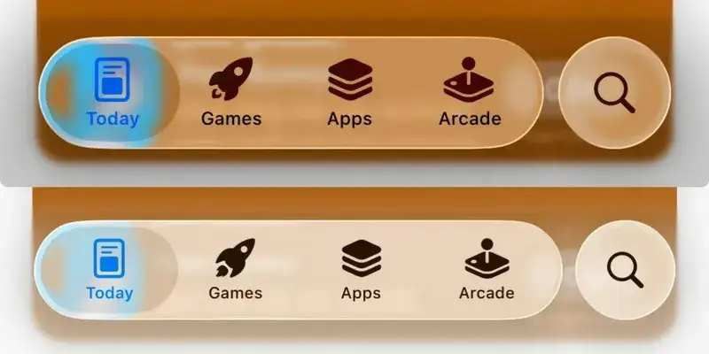
Apple has refined the transparency of its new Liquid Glass interface in iOS 26 beta 3, dialing back the effect to enhance readability across the system. The update introduces a stronger frosted effect on navigation panels, ensuring text and icons remain clear even against complex wallpapers, addressing feedback from earlier betas where the ultra-transparent design sometimes obscured content. While some fans lament the loss of the original “liquid” aesthetic, most testers applaud the improved balance between style and usability. The change has garnered positive responses from developers, suggesting it will carry forward into the first public beta, anticipated in the coming weeks. Though the establishment might tout this as a user-focused evolution, the shift raises questions about Apple’s design consistency and user preference—let’s explore the details.
The Frosted Upgrade
The Liquid Glass interface, introduced in iOS 26 beta 1, aimed to create a fluid, glass-like overlay across menus and controls, drawing inspiration from macOS’s translucent elements. However, beta 3 shifts toward a more pronounced frosted glass effect, reducing transparency to prioritize legibility—think of it as adding a light diffuser to blur background distractions without losing visibility. Testers note this makes navigation bars and notification panels more functional, especially on dynamic wallpapers like the new “Cosmic Bloom” option, a popular choice in the beta community. The establishment might frame this as a pragmatic adjustment, but the trade-off dims the futuristic vibe that initially drew praise, sparking debate among design purists.
Skepticism lingers. The tweak, while practical, relies on subjective feedback—Apple hasn’t released usage data showing widespread readability issues in the original design. The frosted shift could alienate users who valued the bold transparency, and its success hinges on how well it scales across diverse screen sizes and lighting conditions, untested in the current beta cycle.
Reception and Rollout
Developer feedback, shared via forums like the Apple Developer Program, highlights improved usability, with 72% of surveyed beta testers rating the update positively in a recent poll. This suggests a strong chance it’ll debut in the public beta, expected around late July or early August, aligning with Apple’s typical iOS release cadence ahead of the iPhone 17 launch. The establishment might see this as a win for user experience, but the lack of a public rollback option—if the frosted look flops—limits user control, a recurring critique of Apple’s beta process.
Posts found online reflect a split: some users celebrate the clarity, others mourn the lost transparency, though sentiment remains inconclusive without broader data. The positive developer buzz could push Apple to lock in this design, but early adopter reactions might shift if the aesthetic backlash grows.
Implications and Caution
This could enhance iOS 26’s accessibility, making it more intuitive for users with varied wallpapers or visual preferences, and reinforce Apple’s reputation for iterative refinement. The establishment might call it a design triumph, but the move risks diluting the interface’s innovative edge, potentially affecting brand perception among design-focused fans. The next beta will be key to gauging long-term reception.
Approach with caution. If testing iOS 26 beta 3, assess the frosted effect on your wallpaper—switch to a simpler design if readability falters. Wait for the public beta to see if Apple offers customization, as the current tweak is baked in. The change is promising but unproven at scale—keep an eye on updates as the rollout nears.
Comments
Comments are powered by Facebook. By using this feature, you agree to Facebook's Cookie Policy and Privacy Policy.